
Used by: I/O and Calculations, Alarm, Alarm Status, Analog Input, Analog Output, Analog Status, Analog Control, Calculation, Counter, Deadband Control, Digital Control, Digital Input, Digital Output, Digital Status, Function, History Statistics, Modem, Network Status, Pump Status, Rate of Change, Roster, Selector Switch, SMS Appliance, SQL Logger, Totalizer, Trigger.
* Does not use the Style Settings tag.
"2 state" versus "4 state". Not all tags will have all the states shown in these examples. Alarms have only state 0 and state 1 and therefore must use the "2 state" version of this widget.
Digitals might only use two states, but they can have four and therefore must use the "4 state" version of the widget.
The Color Box widget is used to represent the associated tag as a box that changes color based on the tag's value. It is primarily used with that have discrete states such as digitals and alarms, but may also be used with analogs. For an analog tag, the value will be rounded to find the closest match to one of the states.

The properties dialog for a Color Box:
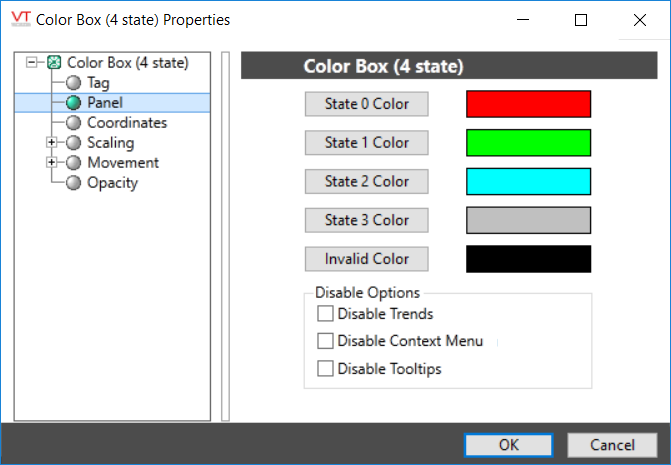
State X Color
Opens the Select Color Dialog from which you can choose a color to display when the tag’s value is in the corresponding state.
Invalid Color
Opens the Select Color Dialog from which you can choose a color to display when the tag’s value is invalid.
Disable Options
Disable selected operator-interaction features of this widget.
See: Operator Interaction Controls
Basic Components\Color Indications\
