(System Library)
| Description: | Draws a list in the style of a spreadsheet. |
| Returns: | Nothing |
Usage:  |
Steady State only. |
| Function Groups: | Graphics |
| Related to: | GUITransform | Bevel | CheckBox | ColorSelect | DropList | DropTree | Edit | GridList | HScrollbar | Listbox | RadioButtons | SpinBox | SplitList | TextBox |ToolBarTreeControl | VScrollbar |
| Format: |
System.GridList(Titles, Data, DataFormat, ColWidthsParm [, NumDataRowsParm, NumDataColsParm, GridListBGndParm, GridColorParm, GridLineWidthParm, GridStyleParm, RowHeightParm, TitleHeightParm, HCellPaddingParm, VCellPaddingParm, HScrollPosParm, VScrollPosParm, DisableVScroll, DisableHScroll, DisableColumnSizing, DisableSorting, DisableSelectedCell, DisableVGridLines, DisableHGridLines, LockFirstColumn , Sort, SelectedRow, SelectedColumn, GridFontParm, GetSortKeyScope, EnableBorderParm, CellTextColorParm, TitleTextColorParm, TitleBackColorParm, TitleGridColorParm, LockFirstColColorParm, CaseSortParm, DisableControlsParm, IsFocusableParm]) |
| Parameters: |
| Titles |
|
Required. The array of the titles you wish to use for the grid column headings. The title bar for a grid can be disabled by setting the Titles array to Invalid, or by setting TitleHeightParm to 0. By default, users will be able to click each of your titles to sort the grid (up or down) by the contents of that column. This (and all other) array parameters must use dynamic arrays. |
| Data |
| Required. The array of data with which to populate the grid. Array elements match grid cells according to: Data[row][col]. |
| DataFormat |
| Required. Usually an array of the data formats corresponding to the values specified in the Data array, in which case there must be one entry per column of data. Alternatively, this may be a single format that will be applied to all values, as shown in the example at the end of this topic. Available format codes are listed in most text functions including GUIText |
| ColWidthsParm |
| Optional. The array of the widths of the columns in pixels. Alternatively, a single value may be used to if all columns are to be the same width. |
| NumDataRowsParm |
| Optional. Specifies the number of data rows to display. Extra cells may be shown according to the height available to the grid, but no data will be displayed after the row set by this parameter. |
| NumDataColsParm |
| Optional. Specifies the number of data columns to display. No extra columns are shown if the Gridlist area is wider than the sum of the column widths. |
| GridListBGndParm |
| Optional. Sets the background color for the cells in the grid. |
| GridColorParm |
| Optional. Indicates the color of the grid lines. |
| GridLineWidthParm |
| Optional. Indicates the width of the grid lines. |
| GridStyleParm |
| Optional. Indicates the style of the grid lines. |
| RowHeightParm |
| Optional. Indicates the height of the rows in the grid. |
| TitleHeightParm |
| Optional. Indicates the height of the column headings row above the grid. The title bar for a grid can be disabled by setting TitleHeightParm to 0, or by setting the Title array to Invalid. |
| HCellPaddingParm |
| Optional. Indicates the horizontal cell padding for the grid. |
| VCellPaddingParm |
| Optional. Indicates the vertical cell padding for the grid. |
| HScrollPosParm |
| Optional. Indicates the horizontal scroll bar position. |
| VScrollPosParm |
| Optional. Indicates the vertical scroll bar position. |
| DisableVScroll |
| Optional. A flag that may be set to TRUE (non-zero) to disable vertical scrolling, or FALSE (0) to enable vertical scrolling. |
| DisableHScroll |
| Optional. A flag that may be set to TRUE (non-zero) to disable horizontal scrolling, or FALSE (0) to enable horizontal scrolling. |
| DisableColumnSizing |
| Optional. A flag that may be set to TRUE (non-zero) to disable column resizing, or FALSE (0) to enable column resizing. |
| DisableSorting |
| Optional. A flag that may be set to TRUE (non-zero) to disable sorting by clicking the column headings, or FALSE (0) to enable sorting by clicking the column headings. |
| DisableSelectedCellParm |
|
Optional bitwise flag. Set bit 0 to disable selected-cell tracking. Set bit 1 to disable highlighting of the selected cell. Defaults to neither bit being set, thereby enabling selected-cell tracking and highlighting. |
| DisableVGridLines |
| Optional. A flag that may be set to TRUE (non-zero) to disable vertical grid lines, or FALSE (0) to enable vertical grid lines. |
| DisableHGridLines |
| Optional. A flag that may be set to TRUE (non-zero) to disable horizontal grid lines, or FALSE (0) to enable horizontal grid lines. |
| LockFirstColumn |
| An optional flag that may be set TRUE (non-zero) to lock the first column from horizontal scrolling (e.g. the first column contains row titles). The default value if Invalid or not supplied is FALSE. |
| Sort |
| An optional parameter that specifies the column on which the GridList is to be sorted. The parameter is 1-based (i.e. a value of 1 refers to the first column). If negative, the sort order is descending If the user clicks a column title to sort the GridList, then the parameter is set to the appropriate value. . If Invalid or not supplied, no column sorting will be applied. |
| SelectedRow |
| An optional parameter that specifies the row of the selected cell. The parameter is 0-based (i.e. a value of 0 refers to the first row). If the user clicks in a cell, then the parameter is set to the index of the selected row. If Invalid or not supplied, no cell is selected. |
| SelectedColumn |
| An optional parameter that specifies the column of the selected cell. The parameter is 0-based (i.e. a value of 0 refers to the first column). If the user clicks in a cell, then the parameter is set to the index of the selected column. If Invalid or not supplied, no cell is selected. |
| GridFontParm |
| An optional parameter that specifies the font to be used for Titles and Grid elements. The selected font will affect all items in the GridList. If using callbacks, it will allow the user to use the same font in their callbacks or have a separate title font and use their own font in their callbacks. Note: Nothing in a GridList is sized based on font size. The caller must ensure that the row and title heights are large enough to accommodate the font. No default value. |
| GetSortKeyScope |
| An optional module value of GetSortKey call-back (example in comments section). Required only when using call-backs for the cells of the Gridlist. |
| EnableBorderParm |
| Optional Boolean. Set true to show a border around the grid. Defaults to FALSE. |
| CellTextColorParm |
| Optional color value. Color of the text in the cells. |
| TitleTextColorParm |
| Optional color value. Color of the text in the title. |
| TitleBackColorParm |
| Optional color value. Color of the title background. |
| TitleGridColorParm |
| Optional color value. Color of the title grid or border |
| LockFirstColColorParm |
| Optional color value. Color of the locked first columns gridline. |
| CaseSortParm |
| Optional Boolean. Set TRUE for case-insensitive sorting. Defaults to FALSE. |
| DisableControlsParm |
| Optional bitwise flags to disable the keyboard or mouse so that the caller can define its own behavior for controls. Set bit 0 to disable keyboard input. Set bit 1 to disable cell selection by the mouse pointer. Default to neither bit set. |
| IsFocusableParm |
|
Optional Boolean. If set TRUE, this allows the gridlist to take the focus when it is clicked on or tabbed to. Such a gridlist will only respond to keyboard input if it has focus. Defaults to FALSE. Note that the focus and keyboard-input behavior will also happen if the selected cell option is explicitly enabled. |
| Comments: |
This module is a member of the System Library, and must therefore be prefaced by \System. as shown in the "Format" section. If your application predates version 11.2, use the backslash notation rather than dot: \System\ Where parameters use arrays, they must be dynamic arrays.
(See: Bitwise Parameters & Operations)
  Data[I]      = Self()      { Module in which the CallBack exists };
  DataForms[I] = "DrawCell"  { The CallBack module used to display a cell in this column };
An example of a GetSortKey call-back module: GetSortKey
(
Row { Row index to get the sort key for };
Column { Column index to get the sort key for };
Inverted { Bool: TRUE if the order is being reversed };
)
Main [
If 1;
[
Return(ToUpper(Data[Row][Column]));
]
]
GridList has been configured to clip text on the right and display a tooltip if there is not enough room to show the entire text string in a cell. Do not place a Tooltip widget over a GridList. See previous note. HasFocus() - Accessor function Script only. You may call this function in on your GridList to determine whether it has focus. |
Examples:
(See also, an example in GUITransform)
Example 1) An extremely simple grid of data:
[
Titles;
Data;
]
Init [
If 1 Main;
[
Titles = New(3);
Data = New(1,3);
Titles[0] = "Title 1";
Titles[1] = "Title 2";
Titles[2] = "Title 3";
Data[0][0] = "Three Men in a Boat";
Data[0][1] = "Heart of a Goof";
Data[0][2] = "Mostly Harmless";
]
]
Main [
GUITransform(0, 1, 1, 0,
1 - 100, 500, 500, 1 - (100), 1,
0, 0, 1, 0,
0, 0, 0,
\System.GridList(Titles { Column Titles Array },
Data { Data Array },
"%s" { Format for Text }));
...
Where: Titles is a one dimensional array of titles, equal to the number of columns. Data is a two dimensional array of values to display. The format is simply "%s" to display as strings.
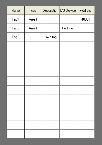
Example 2) A sparse array
{initialize the data array}
Titles[0] = "Name";
Titles[1] = "Area";
Titles[2] = "Description";
Titles[3] = "I/O Device";
Titles[4] = "Address";
Data[0][0] = "Tag1";
Data[1][0] = "Tag2";
Data[2][0] = "Tag3";
Data[0][1] = "Area1";
Data[1][1] = "Area1";
Data[2][2] = "I'm a tag";
Data[1][3] = "PollDrvr1";
Data[0][4] = "40001";
DataForm = "%s";
GUITransform(50, 500, 350, 50 { Reference rectangle },
1 { Scale Left },
1 { Scale Bottom },
1 { Scale Right },
1 { Scale Top },
1 { No overall scaling },
0, 0, 1, 0 { No movement; visible; res },
0, 0, 0 { Not selectable },
System.GridList(Titles { Titles array },
Data { Data array },
DataForm { Cell format },
60 { Column widths array },
3 { # Data rows },
5 { # Data cols },
15, 8 { Grid BGnd, Grid color },
1, 1 { Grid line width, line style},
30, 30 { Row/Title height },
0, 0 { Horiz/Vert cell padding },
0, 0 { Horiz/Vert Scroll position },
1, 1 { Disable V/H scroll bars },
1 { Disable column sizing },
1 { Disable Sorting },
1 { Disable selected cell },
0, 0 { Enable V/H grid lines },
1 { LockFirstColumn },
Invalid { Sort },
0 { SelectedRow },
0 { SelectedColumn },
\_DialogFont { GridFontParm }));
This code example will create a Grid List that looks like the following:
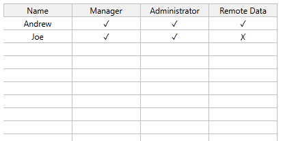
Example 3) Building a grid with data from an application:
The following is coded in a dedicated page.
[
Title = "Privileges List";
Color = "<FFFFFFFF>";
AllAccounts { All accounts and roles };
NumAccounts { Count of user accounts };
AccountKey { Key for each dictionary entry };
LastKey { Used when looping };
Item { One item from the dictionary };
LastItem { Used when looping };
Titles { Array of column titles };
Data { Data for the grid };
I = 0 { Counter };
]
Init [
If 1 Main;
[
{ GetAccountInfo will return Invalid unless the current account has
the Manager privilege. We can use that as a test for whether to
display anything. }
AllAccounts = \SecurityManager.GetAccountInfo();
IfThen(Valid(AllAccounts);
{ Parse the dictionary, removing roles }
Item = GetNextKey(AllAccounts, Invalid, 1, AccountKey);
WhileLoop(Valid(AccountKey),
LastKey = AccountKey;
LastItem = Item;
Item = GetNextKey(AllAccounts, LastKey, 1, AccountKey);
IfThen(LastItem.IsRole == 1,
DictionaryRemove(AllAccounts, LastKey);
);
);
{ Get the number of user accounts and make a data array to hold them }
NumAccounts = GetKeyCount(AllAccounts);
Data = New(NumAccounts,4);
{ Check each account for privileges: Manager, Administrator, and Remote Data }
Item = GetNextKey(AllAccounts, Invalid, 1, AccountKey);
WhileLoop(I <= NumAccounts,
LastKey = AccountKey;
LastItem = Item;
Data[I][0] = Item.AccountName;
Data[I][1] = \SecurityManager.SecurityCheck(-3, TRUE, Item.AccountName) ? "✓" : "✗";
Data[I][2] = \SecurityManager.SecurityCheck(-4, TRUE, Item.AccountName) ? "✓" : "✗";
Data[I][3] = \SecurityManager.SecurityCheck(-47, TRUE, Item.AccountName) ? "✓" : "✗";
I++;
Item = GetNextKey(AllAccounts, LastKey, 1, AccountKey);
);
{ Create titles for the columns }
Titles = New(4);
Titles[0] = "Name";
Titles[1] = "Manager";
Titles[2] = "Administrator";
Titles[3] = "Remote Data";
);
]
]
Main [
Return(Self);
GUITransform(0, 1, 1, 0,
1 - 100, 300, 500, 1 - (100), 1,
0, 0, 1, 0,
0, 0, 0,
\System\GridList(Titles { Column titles array },
Data { Data array },
"%s" { Format for all text }));
]
Assuming that the application has security enabled, the result will be similar to the following. Nothing will appear unless a user who has the Manager privilege is currently signed in. (The check mark and X depend on the file being saved with UTF-8) encoding.
Example 4) A grid that uses a callback with sorting for the title
This example was taken from a script application, starting at the Graphics submodule. Adjust accordingly to use it in a page.
The example illustrates the use of a callback for the title, including the ability to sort the data when any cell in the title row is clicked. If a callback is used for the titles, then one must also be used for the data cells. The callback is deliberately simple for brevity. Note that boundary lines and up/down arrows are missing. If defining a callback to draw the title cells, you must provide for all aspects of the cell's appearance.
<
{============================= System\Graphics ===============================}
{ This module handles all of the graphics for the application }
{=============================================================================}
Graphics
[
Data;
Formats;
DrawTitle MODULE { Callback module to draw titles };
DrawCell MODULE { Callback module to draw data cells };
GetSortKey MODULE { Callback module to get sort key };
]
Init [
If 1 Main;
[
Data = New(3, 3);
Formats = New(3);
Data[0][0] = 1; { Simple data values for the example }
Data[1][0] = 2;
Data[2][0] = 3;
Data[0][1] = 16;
Data[1][1] = 15;
Data[2][1] = 14;
Data[0][2] = "b";
Data[1][2] = "a";
Data[2][2] = "c";
Formats[0] = "DrawCell"; { Using the DrawCell call-back }
Formats[1] = "DrawCell";
Formats[2] = "DrawCell";
]
]
Main [
GUITransform(0, 1, 1, 0,
1 - 100, 500, 500, 1 - (100), 1,
0, 0, 1, 0,
0, 0, 0,
\System.GridList("DrawTitle" { Column Titles Array },
Self { Data Array },
Formats { Format for Text },
60 { Column widths array },
3 { # Data rows },
3 { # Data cols }));
]
<
{==================================== DrawTitle ==============================}
{ Callback to draw a custom title row for the Gridlist. }
{=============================================================================}
DrawTitle
(
CallBackScope { The callback module of GridList };
TitleIndex { The index of the title to be seen };
)
[
Titles { Titles will be shown. This could be defined
in the parent module, and could be any format
besides an array };
]
Init [
If 1 Main;
[
Titles = New(3) { Using a simple array of values for the example };
Titles[0] = "Title 1";
Titles[1] = "Title 2";
Titles[2] = "Title 3";
]
]
Main [
{ GUIText or any customized call back module to show the title }
If GUIText(0, 18, 60, 0 { Unit bounding box },
1, 1, 1, 1, 1 { Scaling },
0, 0 { No movement },
1, 0 { Visible, Reserved },
68 { Button },
0, 0 { FocusID, Trigger },
-1, 0, 0 { Colors },
4, 4 { Alignment },
"%s" { Format },
Titles[TitleIndex] { Text to display });
[
{ Gridlist will adjust the sorting for us accordingly }
CallBackScope.TitleClicked();
]
]
{ End of DrawTitle }
>
<
{==================================== DrawCell ===============================}
{ Callback to draw a custom cell row for the Gridlist. }
{=============================================================================}
DrawCell
(
Row;
Col;
)
Main [
{ GUIText or any customized call back module to show the data cell }
GUIText(0, 18, 60, 0 { Defined unit bounding box },
1, 1, 1, 1, 1 { Scaling },
0, 0 { No movement },
1, 0 { Visible, Reserved },
68 { Button },
0, 0 { FocusID, Trigger },
-1, 0, 0 { Colors },
4, 4 { Alignment },
"%s" { Format },
Data[Row][Col] { Text to display });
]
{ End of DrawCell }
>
<
{=================================== GetSortKey ==============================}
{ Callback to get the sort key for the GridList. }
{=============================================================================}
GetSortKey
(
  Row         { Row index to get the sort key for         };
  Column      { Column index to get the sort key for      };
  Inverted    { Bool: TRUE if the order is being reversed };
)
Main [
  If 1;
  [
     Return(ToUpper(Data[Row][Column]));
  ]
]
{ End of GetSortKey }
>
{ End of \System.Graphics }
>
