Add Line Charts to Reports
The Report Studio is still under development and has not officially been released. Be warned that code may change such that reports you create with this pre-release trial version might need to be updated in order to continue working after your next VTScada update.
Until the official release, documentation for the Report Studio will open in response to the F1 key but will not be shown in the menu system. To view a table of contents for the complete chapter, navigate to Report Building (Report Studio)
Add a line chart to your report to display trends over time. Line charts are supported in all output types except CSV. Tag Query Data Sets can be plotted in relation to time (The X-axis can only be time based.)
The chart will only show within the reporting period up until the last data point retrieved. This prevents confusion if there is a discrepancy between the time of the last data point and the end of the reporting period.
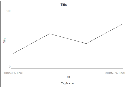
An example of how the line chart appears in the Report Studio.
Preview your report to see how the chart appears with your current configurations and real data.
Add a Line Chart to your Report Studio Canvas
In the Report Studio, drag a line chart onto the canvas. You can delete the chart by clicking on the chart to open a configuration panel on the right and then clicking the trash can icon to the right of the Line Chart Properties panel title.
If the Line Chart element is not selected then hovering your cursor over the chart highlights four major configurable elements. The chart as a whole (try hovering over "Title" at the top), the Y-axis along the left-hand side, the X-axis along the bottom and the plot area in the center. Click on each area to open a new panel of options to the right.
Properties for the Chart as a Whole
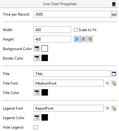
Time per Record
Set the record frequency by time (in seconds) between each data point. This is used for consistent data aggregation from row to row for all queries in the table. Neither 0, nor "Raw data" are an option here. If raw data is needed, select that option when defining your Tag Queries.
The following table of typical values may be helpful:
Time per Record (sec) Equals 900 15 minutes 3600 1 hour 86400 1 day 604800 1 week
Width x Height or Scale to Fit
Set the width and height of the chart in pixels. The chart default is 600 x 400. When Scale to Fit is enabled the height and widget will be set such that the aspect ratio is maintained while consuming as much width as possible. In a XLSX![]() Birth certificate for Sparkplug Edge Nodes output type, the chart will grow to the size of the widest static component. This takes advantage of the scalable property of the SVG
Birth certificate for Sparkplug Edge Nodes output type, the chart will grow to the size of the widest static component. This takes advantage of the scalable property of the SVG![]() Death certificate for Sparkplug Edge Nodes image being rendered such that, at any size, the image will always appear correct and accurate.
Death certificate for Sparkplug Edge Nodes image being rendered such that, at any size, the image will always appear correct and accurate.
Left-Center-Right Justified
Specify where the chart will appear laterally in your report.
Background Color and Border Color
This "Background color" specifies the color of the margins of the report. The "Border Color" specifies the color of the very edge around the outside of the report. The defaults are white for the background and black for the border. To change the background color of the plot area, see the Appearance panel.
Title, Title Font & Title Color
Specify the title that will appear at the top of the line chart (Leave blank to have no title). Select a Font Style tag and open the color selector to change the font and color. The default is "Title" in MediumFont, black.
Legend Font, Legend Color & Hide Legend
The legend, at the bottom of the chart, displays each plot line with a label. Select a Font Style tag and open the color selector to change the font and color of the text. The plot line color and style will match the plot line as it is illustrated in the chart. The default font is ReportFont in black. Enabling Hide Legend will remove the legend from the chart completely.
Title, Title Font & Color
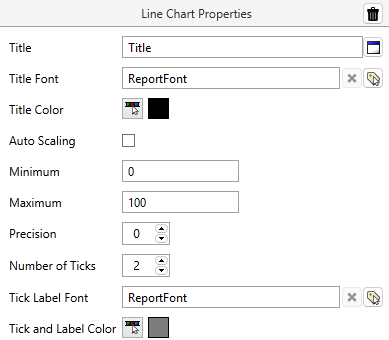
Set the title of the Y-axis (Leave blank to have no title). Select a Font Style tag and open the color selector to change the font and color of the Y-Axis title. The default is "Title" in ReportFont, black.
Auto Scaling or Setting a Minimum & Maximum
Minimum and Maximum refer to the scale of the Y-axis. Select a range manually or enable auto scaling to override the manual setting. Auto scaling will automatically determine the range based on the range of the selected Data Set. The default range is 0 to 100.
Precision
Select how many decimal places appear after the decimal point. Default 0.
Number of Ticks, Tick Label Font & Color
Select how many graduations by which to divide the plot area along the Y-axis. The minimum number is 2 (for the minimum and maximum range values). Select a Font Style tag and open the color selector to change the font and color of the number values that appear next to each tick.
Title, Title Font & Color
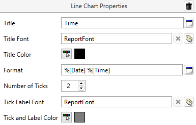
Set the title of the X-axis (Leave blank to have no title). Select a Font Style tag and open the color selector to change the font and color of the X-Axis title. The default is "Title" in ReportFont, black.
Format
Select a parameterized phrase to generate the time scale labels.
Number of Ticks, Tick Label Font & Color
Select how many graduations by which to divide the plot area along the X-axis. The minimum number is 2 (for the minimum and maximum range values). Select a Font Style tag and open the color selector to choose the font and color of the date/time values that appear next to each tick. If your values overlap, consider choosing a shorter format or increasing the width.
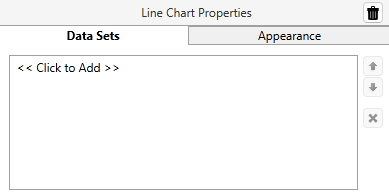
Select << Click to Add >> to see a list of Tag Query Data Sets you have already made and the option to create a new one. Multiple Data Sets can be plotted on the same chart. Use the arrows on the right to move items on the Data Set list up or down. Select an item on the Data Set list and click on the [ x ] button to remove it. You can also copy Data Sets from this panel.
Once a Data Set is created or selected, you can modify it exactly as you would when configuring Data Sets in a typical Report Studio table.
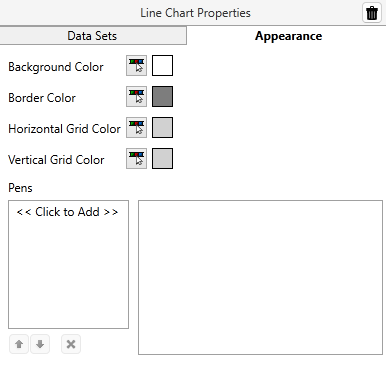
Background Color and Border Color
This "Background color" specifies the color of the plot area of the report. The "Border Color" specifies the color of the very edge around the outside of the plot area of the report. The defaults are white for the background and gray (<FF7D7D7D>) for the border.
Horizontal & Vertical Grid Color
Grid color refers to the color of the horizontal and vertical graduations that appear if more than 2 ticks are configured for the X-axis or Y-axis. The default color is a light gray (<FFD1D1D1>)
Pens
If this section is left blank, VTScada will select colors for each pen in the chart. Select << Click to Add >> to expand your options, noting that pen properties are applied in the same order as tags appear in the Data Set.
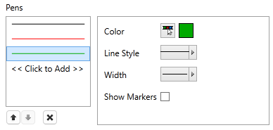
As new pens are added, the Report Builder will automatically select a color that is distinct from the other pens. Use the tool shown in the preceding image to change the color, style, and width as desired for each successive pen added to the chart. Line style and width will be inherited from the last pen added.
Your tags might have display properties configured for use in the Historical Data Viewer. Note that those properties are not used by the Report Builder.
Enabling Show Markers will add a dot on the plot line at each data point. Markers are especially helpful in cases where only a single data point is retrieved. Without a marker, a single data point will not visibly render.
