
Provides a visible indication when the linked tag is in an active or unacknowledged alarm state, and when it is either shelved or disabled.
This widget is not visible for alarms that are unacknowledged but no longer active unless the property AlarmPriorityIndicatorShowNormalUnacked is set to 1. (Note that "trip" alarms are never in an active state.) The widget is always displayed when the alarm is shelved or disabled.
If you are working in a Master Application and link your Alarm Priority widget to a tag that is created in that Master Application and that also has child tags from a Subordinate Application, be aware that alarms from the subordinate tags will not flow through the local tag to be shown by your widget. Alarm Priority widgets in a Master Application that are linked directly to tags belonging to a Subordinate Application will work as expected.
You can link this widget to a parent tag rather than a specific status tag. When linked to a parent, it will activate when any child tag in the hierarchy is in an active alarm state. The icon will display the highest priority of the set of active alarms.
If the alarm (or set of alarms in child tags) includes a shelved alarm, then the widget will activate and display an S. If the linked tag (or child tags) includes a disabled alarm, the widget will display an X.
If linked to a parent tag, and within the set of child tags there are unacknowledged alarms, active (but acknowledged) alarms, shelved alarms and disabled alarms, then the order of precedence for the display is as follows:
- Unacknowledged (icon blinks with the highest priority alarm of the set)
- Active (icon shows the highest priority alarm of the set)
- Disabled (icon shows an X)
- Shelved (icon shows an S)
The color used when shelved or disabled is controlled by the property AlarmPriorityIndicatorColor, defaulting to a pale gray.
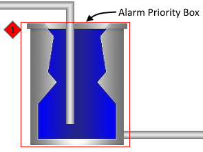
This widget is identical to the Alarm Priority Icon, but adds a box that you can place around the image representing the equipment that will trigger the alarm.
The icon is visible only when the linked tag is in an active alarm state. The shape, color, and text shown in the icon are controlled by the configuration of the Alarm Priority Tag used for that alarm.
As with any other widget, operators can right-click to open a pop-up menu for the linked tag, provided that they have sufficient privileges, and that you have not configured the icon to disable the pop-up menu. This menu includes a link to navigate to the Alarm Page. Note that only the icon is a valid target for the right-click. The box portion of this widget will not respond to operator actions. This is done so that the box does not interfere with controls or linked widgets within its area.
The properties dialog for the Alarm Priority Box:
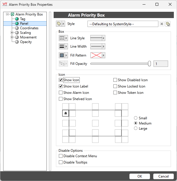
Tag
Link this widget to the tag whose active alarm or control lock state is signaled by the icon.
Style
Linked to the System Style Settings tag by default. This controls only whether the icon should blink while the alarm is unacknowledged. The color of this widget is affected only by the Alarm Priority, not the linked Style Settings tag.
Box Options
Includes options for Line Style, Line Width, Fill Pattern and Fill Opacity. By default, the Alarm Priority Box is a single continuous line. You may select any of VTScada's existing line styles, and any line width up to 30 pixels.
The default box has no fill pattern, but you may add any of VTScada's existing patterns. If using a pattern, and if the box is displayed over other objects on the page, you should decrease the opacity, making it possible for the operator to view both.
Show Icon
Deselect this option to remove the icon, leaving only the box to signal the active alarm state.
Show Icon Label
Select this option to display the text portion of the alarm priority or lock level.
Show Alarm Icon
If selected, the widget will display the Alarm Priority level icon for the associated alarm.
Show Shelved Icon
If selected, the widget will remain visible while the alarm is shelved, notifying operators of that status.
Show Disabled Icon
If selected, the widget will remain visible while the alarm is disabled, notifying operators of that status.
Show Locked Icon
If selected, the widget will show the Lock Level icon for the associated tag, if that tag has a Control Lock applied.
Icon - Position grid
Not available if the icon has been disabled. Click any of the squares to place the icon at that position relative to the box.
Icon - Small / Medium / Large
Not available if the icon has been disabled. Sets the relative size of the icon. This option defaults to medium. Choose a smaller size to avoid overlap with other objects in a crowded page, or a larger size to improve the visibility of the indicator.
Disable Options
Disable selected operator-interaction features of this widget.
See: Operator Interaction Controls
Tools\Alarm Tools\
High Performance\
