Used by: I/O and Calculations, Alarm, Alarm Status, Analog Input, Analog Output, Analog Status, Analog Control, Calculation, Counter, Deadband Control, Digital Control, Digital Input, Digital Output, Digital Status, Network Status, Pump Status, Rate of Change, Selector Switch, Totalizer, SQL Logger, Totalizer, Trigger, .
* Does not use the Style Settings tag.
"2 state" versus "4 state". Not all tags will have all the states shown in these examples. Alarms have only state 0 and state 1 and therefore must use the "2 state" version of this widget.
Digitals might only use two states, but they can have four and therefore must use the "4 state" version of the widget.
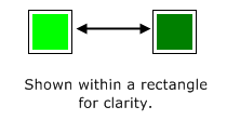
The Color Blink tag widget is used to create a color box that blinks to indicate the state of the underlying tag. Blinking is an extremely eye-catching visual feature and should only be used in situations where it is of utmost importance for an operator to notice the state of a tag. Do not use this widget casually.

You can configure two colors for each state: the status color, and the blink color. The widget will alternate between these colors according to the On Time and Off Time configured for each state.
If one of the colors is left unconfigured, or set to transparent, the object will seem to appear and disappear. If the colors are identical, nobody will notice the blinking. In general, it is best to use either a light and dark shade of the same hue, or to leave one of the colors transparent or unconfigured.
If a page is intended to be viewed on a VTScada Thin Client, it is recommended that Color Blink objects and Animated Bitmap objects not be used. This is due to possible latency and bandwidth issues. If you must use Color Blink objects, please ensure that you set slow blink rates.
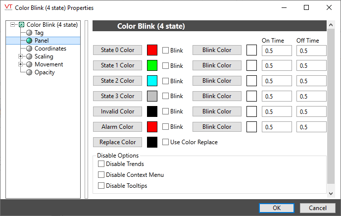
An example of a configured properties dialog for a Color Blink.

The color blink widget is used most effectively with digital tags, or tags that have binary states such as alarms. If used with an analog tag, the tag’s value will be rounded to obtain the closest value of 0, 1, 2 or 3 (repeating).
State x Color
Opens the Select Color Dialog from which you can choose a color to display when the tag’s value is in the corresponding state.
Blink
This check box must be selected if you wish the completed Color Blink object to alternate (blink) between the State X Color and the corresponding Blink Color.
Blink Color
Opens the Select Color Dialog from which you can choose a blink color to display when the tag’s value is in the corresponding state.
On Time
Sets the amount of time (in seconds or fractions of a second) that the Blink Color should be displayed.
Off Time
Sets the amount of time (in seconds or fractions of a second) that the State X Color should be displayed.
Alarm Color
Opens the Select Color Dialog from which you can choose a blink color to display when the tag’s value is in an alarm state.
Replace Color
Opens the Select Color Dialog from which you can select the background color upon which the completed object will be placed. This object will only be visible when placed over the selected color.
Use Color Replace
Select to indicate that you wish to use the configured Replace Color (see above). If the Use Color Replace check box is not selected, then the object will always be visible over any background color.
Disable Options
Disable selected operator-interaction features of this widget.
See: Operator Interaction Controls
Basic Components\Color Indications\
