
Support will continue for existing applications, but this widget is not available for use in new applications.
Used by: I/O and Calculations, Analog Input, Analog Status, Analog Output, Analog Control, Selector Switch.
* Does not use the Style Settings tag.
The Droplist Control widget creates a drop-down list from which operators can select discrete values to output. (0 to 31)
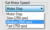
Regardless of the text used for each label, output values are integers beginning with 0 and increasing to the largest configured value, up to 31. The example shown here assumes that the underlying control will set the motor speed to 250 when a value of 1 is sent, 500 when a value of 2 is sent and so on.
The properties dialog for the control will appear similar to the following. Note that the control will always output values up to the largest text value configured. Should you skip one of the Text To Display boxes, that value will still be included in the drop list, but will display nothing to tell operators what it is.
The source of the text for each entry in the drop list may be any of: text, a tag value, the value of a selected parameter, or an expression.
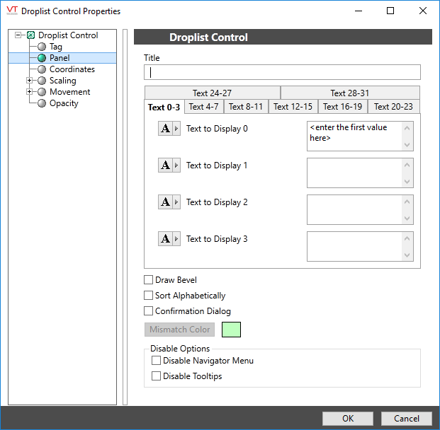
Title
Sets the title, should you wish to include one above the drop-down list. Enabled whether the bevel is drawn or not.
Draw Bevel
Encloses the drop down in a beveled rectangle when selected. The example shown at the beginning of this topic uses a title and bevel.
Sort Displayed List
Sort the list alphabetically by label. Output values stay with their title and therefore, are likely to be in a scrambled order after the list is sorted.
Text to Display n
Sets the text to display for each output value, n. The number of items in the list is controlled by the largest value for which the Text to Display field has been configured.
Sort Alphabetically
When selected, the droplist will be reorganized into alphabetic order by text for the output values, rather than being ordered by output value.
Confirmation Dialog
When selected, the operator will be prompted to confirm the control action.
Mismatch Color
Used only when the associated tag is a Selector Switch, or an Analog Input or Analog Status type, configured to write values. When the last value written does not match the value being read, the widget will display the configured mismatch color.
Disable Options
Disable selected operator-interaction features of this widget.
See: Operator Interaction Controls
Analog controls\
