Droplist Widget
Formerly, the String Droplist Widget. This has been updated and replaces the older Droplist Control Widget (Legacy version)
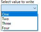
The Droplist widget can write an operator-selected value from a defined list to an output device. The write occurs when a value is selected in the list. Use of the confirmation dialog is suggested.
If the linked tag's Questionable Data flag is set, a question mark will be shown before every item in the list.
When displaying Memory Tags that are configured to allow the value to be cleared, the first entry will be "No Data", having a value of "Invalid".
The value matching each label can be text or numeric. Use care to define only values that are appropriate.
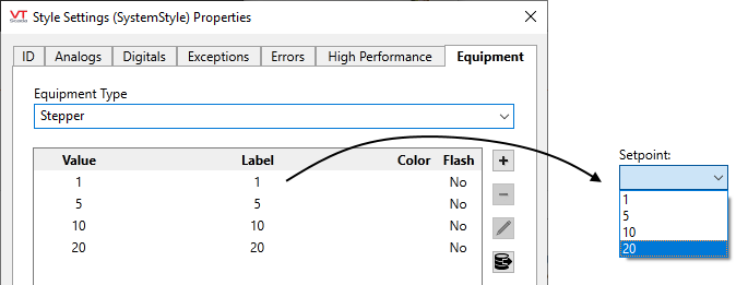
Values for each label can be set within the widget's properties dialog, or if the tag has an equipment type, you can set the values within the matching Style Settings properties: Equipment tab
The properties dialog for the Droplist widget:

Use Tag Equipment Type Labels
When selected, both labels and values are provided by the equipment type matching the linked tag. These must be configured in the selected Style Settings properties: Equipment tab
Label and Value
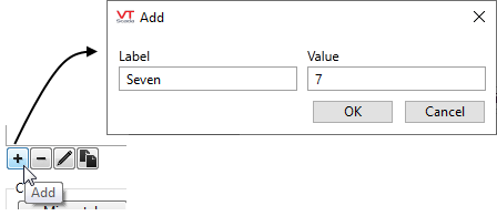
The list of possible values, and the label that is associated with each value. Values may be text or numeric. If numeric, there is no requirement that values must be consecutive. (Values of 10, 20, 30 are as valid as 1, 2, 3.) Scaling in your output tag will limit the range of possible values.
You cannot use tags or expressions to create dynamically-assigned values.
Use the tools below the list to create or edit the values and labels. You can also double-click an entry to open it for editing. When creating a list of similar values, you may find it easier to copy and edit entries than to create each individually.
Display
Title
Provide text that will tell the operator what to use this Droplist field for.
Style
Linked to the System Style Settings tag by default. Needed if you choose the option, Use Tag Equipment Type Labels. (See following notes.)
Font
Controls the display characteristics of the data entry field, but not the label. If you set individual characteristics using the Format ribbon, this will be an expression, combining those characteristics. Otherwise, select a font tag.
Note: While it is possible (and very easy) to modify the appearance of the text within this widget using the Format ribbon of the Idea Studio, you will find it much easier to manage a group of similar controls by defining a font tag and selecting that for each. Changes to all can then be made by adjusting the properties of a single font tag.
Mismatch Color
If the driver supports read and write operations at the same address, then when the last value written does not match the value being read, the widget will display the configured mismatch color.
Align Title
Choose whether the title should be included in the vertical alignment calculation. For example, if vertical alignment is top-aligned and the align title option is not selected then the title will extend above the widget's bounding box.
Draw Bevel
Select whether the completed object should be drawn with a beveled border. If the Draw Bevel check box is selected, the completed object will be drawn with a border surrounding it.
Write Blank as Invalid
Do not select when the control writes to a PLC or RTU. This option may be used when required by a Recipe Parameter Tag
Options
Confirmation Dialog / Disable Control / Disable Context Menu / Disable Tooltips.
Refer to Operator Interaction Controls for a full description of these standard widget options.
Forms
Include in Form
Select if this widget is to be included in a data entry form. If selected, this widget will interact with the submit, clear and date time selector widgets.
Time Offset
A numeric value that specifies the quantity of time offset. A time offset is added to a date selector offset. A 15 minute offset applied to an 11:00 AM submission will be recorded as 11:15 AM.
Time Units
A droplist that specifies the unit of time offset in minutes, hours, days or weeks.
Choices for Operator Interaction
Analog Controls\
Text\
Tools\Forms\
