
Used by: I/O and Calculations, Allen Bradley driver, Alarm Status, Analog Input, Analog Status, Analog Output, Analog Control, Calculation, Counter, Data Flow RTU, CalAmp Diagnostic driver, DDE Client, Deadband Control, DNP3 driver, Driver Multiplexer, Function, History Statistics, MDS driver, Modem, Modbus Compatible Device , Omron driver, OPC Classic Client, Polling Driver, Rate of Change, Script, Selector Switch, Serial Port, Siemens S7 driver, SMS Appliance, SNMP driver, SQL Logger, Totalizer.
* Does not use the Style Settings tag.
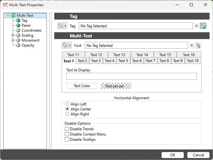
The Multi-text tag widget displays a variety of messages, each in its own color, in response to changing conditions within the application.
You can create up to 16 messages using the Text 1 through Text 16 tabs. The Text 1 message is the default, to be shown when the defined conditions have not been met for any of the other messages.
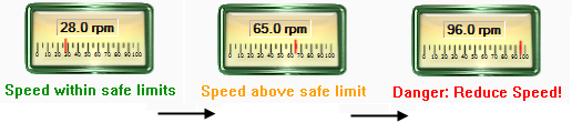
The following example shows a multi-text display below a Linear Gauge widget. As the tag’s value increases, the multi-text displays a different value to either inform or direct the operator, and uses a different text color to catch the operator’s attention.
The Multi-text is configured by creating a series of increasing trigger points and assigning a color and message to display as each point is reached. The trigger points can be given constant values, or can take their value from either a tag or parameter.
The initial message, text 0, does not have a trigger point because it will be the text displayed until the tag’s value reaches the first assigned value. Two versions of the properties dialog for this widget are shown:
Reference: Advanced Formatting: Options for Properties
What happens if the set point for Text 3 is reached before that of Text 2?
If using constant values, you cannot assign a lower trigger point for a higher text number. This situation can occur if the trigger point for each text message is provided by different tags, parameters, or expressions.
The multi-text widget will display each defined message in order from Text 1 through to Text 16. The message and color for Text 1 will be displayed until the comparison condition for Text 2 has been reached. Until the set point for Text 2 has been reached, it does not matter whether any other comparison condition has been exceeded.
After the comparison for Text 2 has been passed, the multi-color will go on to check the comparison for Text 3. If it has already been passed, then the message for Text 2 will be skipped in favor of the message for Text 3.
The same comparison order is used whether the Tag's value is rising or falling.
Font
Select one of the font tags (or parameter linked to a font tag) that you wish to use to display the text. The display will use the default system font if you do not select a font tag.
The parameters button is enabled only if the tag is drawn on a page that includes a font parameter, or if the tag is part of a widget and the associated widget editor is open.
Note: While it is possible (and very easy) to modify the appearance of the text within this widget using the Format ribbon of the Idea Studio, you will find it much easier to manage a group of similar controls by defining a font tag and selecting that for each. Changes to all can then be made by adjusting the properties of a single font tag.
Text 1… Text 16 tabs
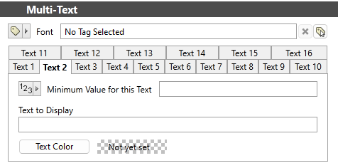
Select each tab in turn, up to the number of messages you wish to display. Each tab after Text 1 sets a trigger point using either a constant, tag or parameter, and message + color combination to display when that point is passed. Each consecutive tab used must set a greater trigger point than the previous.
Minimum Value for this Text
Shown only when Text 2 or greater is open. Sets the trigger point, above which the set color will be displayed (until the next trigger point is reached). The value for this point may be provide by any of a user-defined constant, an expression another tag or a parameter.
Text to Display
Enter the text that you want to have displayed when the tag’s value goes above this trigger point.
Text Color
Opens the Select Color Dialog from which you can select a color to display when the matching trigger point has been reached.
Horizontal Alignment
Configure the text to be left, center or right-aligned within the widget's bounding box.
Disable Options
Disable selected operator-interaction features of this widget.
See: Operator Interaction Controls
Gauges\Basic Analogs\
Text\
Choices for Operator Interaction
Multi-Color Widget - Display up to 16, solid colors for increasing values.
