
Used by: I/O and Calculations, Alarm Status, Analog Input, Analog Output, Analog Status, Analog Control, Calculation, Comm Link Sequencer, Counter, Deadband, Digital Control, Digital Status, Function, History Statistics, Network Status, Pump Status, Rate of Change, Script, Selector, Totalizer, Trigger, SQL Logger.
* Does not use the Style Settings tag.
The Two Color Bar tag widget is used to display tag data using an animated, multi-colored bar. Its appearance is similar to the Color Fill widget with the addition of a second color that will be displayed when the value goes above a set point. A common use of this second color is to provide clear notice that a value is above its safe limit.
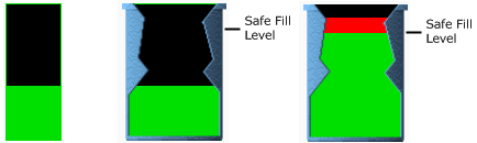
Examples showing the Two Color object, the same object behind a tank cut-away image and again with a value exceeding the set point.
Despite the name, four colors are used to fully configure the Two Color Bar object:
- The value of the tag is displayed in one color, the Bar Color, shown as green in the example.
- The portion of the tag's value exceeding a user-defined setpoint value is displayed in a second color. This is the High Color, shown as red in the example.
- The background of the object's drawing area is displayed in a third color: the Unfilled Color.
- If you would like this object to be visible only where it overlaps a defined area, you may set the Changed Color to that of the defined area. Any portion of the Two Color object not over that color will be invisible. This feature can be used to build your own tank cut-aways.
The properties dialog for the Two Color widget will look similar to the following. There must be a Filled Color, but you are free to leave the Changed Color and Unfilled color properties unselected.
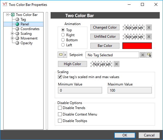
Animation
Select one of Top, Right, Bottom or Left to set the direction that the bar will grow with increasing values.
Changed Color
If set, the object will only be visible when placed above an area of this color. The button opens the Select Color Dialog from which you can choose a color. Select transparent to stop using the changed color. Click the X button to remove the color if you change your mind.
Bar Color
Opens the Select Color Dialog from which you can choose a color to that will represent the tag’s value.
Unfilled Color
Opens the Select Color Dialog from which you can choose a color to display as the background for the bar color.
Setpoint
Use this field to define the point, above which the tag’s value will be shown using the High Color rather than the Bar Color. May be set using any of a constant value, an expression, a second tag’s value or a page parameter.
High Color
Opens the Select Color Dialog from which you can choose a color to display for the portion of the bar showing the value above the set point.
Use Tag's Scaled Min & Max Values
In most cases, it is best to select this option. When the tag is at its minimum scaled output value, the bar will not be visible and when the tag is at its maximum scaled output value, the bar will fill the area of the widget.
Choosing not to use the tag’s scaled min and max values enables the Minimum Value and Maximum Value controls which you can use to scale the bar length relative to the tag’s output scaled values. The scaling you set will apply only to this one instance of the tag widget. This option is normally used when the object represents tags such as Calculation and Function that do not have their own scaled values.
Unlike widgets such as the Top Bar, the bar for the color fill will be visible only within the area originally drawn for this object, regardless of the scaling you define.
Minimum Value and Maximum Value
The Minimum Value and Maximum Value fields are used to scale the color fill bar relative to the tag’s scaled output values. For example, given a tag with scaled output ranging from 0 to 100:
Setting the widget’s scale range from 0 to 200 results in a bar that reaches only half the length drawn when the tag is at its maximum value.
Setting the widget’s scale range from 0 to 50 results in a bar that reaches its full length when the tag is still only half way to its maximum value.
Unlike widgets such as the Top Bar, the bar for the color fill will be visible only within the area originally drawn for this object, regardless of the scaling you define.
Disable Options
Disable selected operator-interaction features of this widget.
See: Operator Interaction Controls
Basic Components\Bars\
Basic Components\Color Indicators\
