Draw HDV Widget
* Does not use the Style Settings tag.
Add a scalable view of the Historical Data Viewer to any page as a widget. This widget is designed to be linked to a parent tag, which may be either a Context, or a user-defined type that was created from a Context tag. Alternatively, you may select an existing pen group for it to display.
After adding this widget to a page, the properties dialog allows you to select a pen group but not a tag or other data source. Use the Widget Properties ribbon or the right-click menu to link this widget to a parent tag.
After linking this widget to a tag, there is no way to return to selecting a pen group instead. Replace the widget with a fresh copy.
If linking to a parent tag (Context or user-created type), use the widget's properties dialog to select the child tags that should be included in the plot. You can also configure the appearance of the HDV, including title bar, time selector (footer bar), colors and more. A useful technique is to add the DrawHDV widget to a parameterized page, linking the widget to a page parameter of type, tag. Menu entries or page hotboxes are then configured to use different instances of the user-created tag type when opening the page.
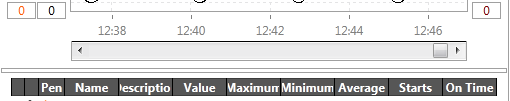
Components of the HDV including the toolbar, legend, and scales may be configured to be hidden or displayed as required.
If running a legacy application (created with 11.0 or earlier), user-created tag types will not link to a Draw HDV widget without additional code.
Procedure for use:
- Add the Draw HDV Widget to a page.
- Link the widget to a context tag or user-defined type, containing the tags to be plotted.
- Open the Properties dialog of the Draw HDV Widget.
- Open the Tag Selector.
- Select child tags and add queries if necessary. Click OK.
- Adjust other display options as required.
The legend grid and the divider between the legend and the graph can be adjusted only in the live view, not in the Idea Studio.
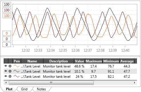
- You can left-click on the graph to add value labels.
- You can open a properties menu for each pen.
- The full controls of the HDV window are not shown by default, but may be added using options in the widget's properties dialog.
The properties dialog for the Draw HDV will vary, depending on whether it is linked to a type or using a named pen group.
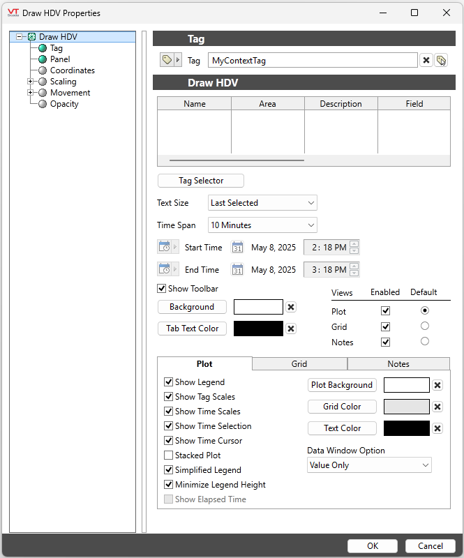
Linked to a type.
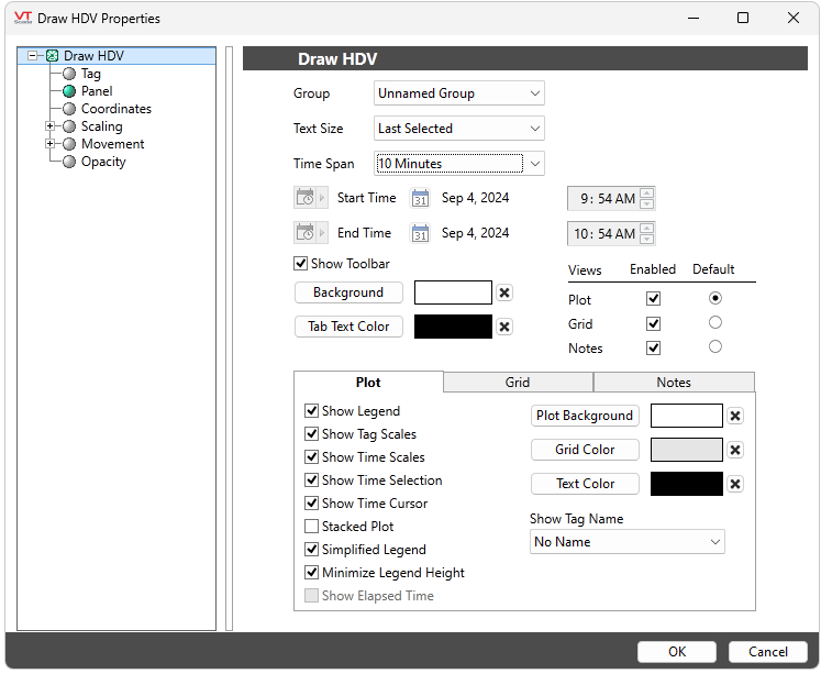
Using a pen group
Access to the Tag Selector (Select Pens (Tags) to Plot) is available only when the widget is linked to a parent tag.
Display a fixed time range on the DrawHDV widget. Select a "Custom" time span to enable time range mode. This will enable you to select a start time and end time in the widget property dialog and will enable "Show Elapsed Time" as a plot option.
In time range mode, you can zoom in and drag the plot as usual, however, you cannot scroll past the end time or before the start time.
The plot option "Show Elapsed Time" is TRUE by default in time range mode. Toggle this option to switch between plotting the x-axis with time elapsed or with time stamps.
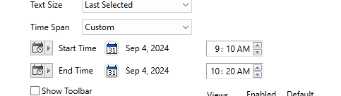
The time range can be set by any of the following:
Timestamp
Click the "Set Date and Time" button to access calendar controls that you can use to set specific start and end times.
Note that these are absolute values that can be changed only be re-configuring the widget. For relative values that will update based on user-specified parameters select one of the following options.
Tag Value, Parameter, Linked Tag Property, Expression
These are advanced configuration options. Whichever option you select, it must be configured to supply UTC values for the start and end times. These are likely to be relative to whenever the report is run and therefore you will need to write an expression to calculate those UTC values. Look first to the TimeUtils library for a way to generate the boundary times. If that library does not provide the time range you require, refer to notes in the section Time and Date Functions in Expressions.
Tag (If linked to a tag)
The selected context or type, if not using a pen group.
Child Tags (If linked to a tag)
If using a linked tag rather than a named group. The list of child tags of the selected parent that could be plotted, but have not yet been selected.
Selected Tags (If linked to a tag)
If using a linked tag rather than a named group. The list of tags that have been selected to be shown in the HDV widget.
Group (If not linked to a tag)
Select an existing pen group to display.
Time Span
Select the length of time to display in the HDV. Options match those in the full HDV page, ranging from one second to five years.
Text Size
Choose between five sizes of font for the scale labels. Sizes range from small to extra large where each size is two points larger than the last.
You also have the option of allowing the widget to remember and use the last user-selected font size rather than defining a default size.
Show Toolbar
When selected, the full set of HDV tools will be displayed across the top of the widget. The toolbar does not scale, therefore if the widget is not wide enough to show all the buttons, those on the right will be lost.
Show Time Selection
When selected, the HDV's time scroll bar will be added between the graph and the legend.
Views: Plot View, Grid View & Notes
Control whether the widget can display the Plot View, the Grid View, and the Notes view. If more than one is selected, choose which view should be shown by default when the page is opened.
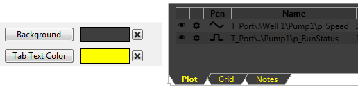
Background Color and Tab Text Color
Sets the background and tab-text colors of the overall widget. (Plot, grid and other text colors are set in the following section.)
Plot View Options
Options as shown to control what will be included in the plot view of the HDV display, including:
- Choice of color for the background, grid lines and numeric scale. The "X" beside the color choice will reset each value to the default color.
- Options to display the legend, tag scales, time scales, stacked plots.
- Option to display a full legend including statistics or simplified legend of tag identification and values only.
- Option to show the time cursor (vertical line following the pointer).
- Option to minimize the legend height. When selected, the legend will be no taller than required to show the list of pens, up to a maximum of 50% of the widget height.
- Option to plot x-axis with time elapsed or time stamps. Only enabled in Time Range mode. In Time Range mode, show elapsed time is TRUE by default.
Grid View Options
Options to control what what will be visible, and what the default settings will be when an operator views the grid. If the toolbar option is not provided, then the default settings will be the only view possible in the grid.
- Option to show the newest value at the top (or at the bottom if not selected).
- Select between data retrieval modes, raw values, averages, minimums or maximums.
- For all data retrieval modes other than raw values, set the time per record (row) for each average, minimum or maximum.
- Choose colors for the cell background and the grid lines.
Removing each will result in the default colors being used.
Notes View Options
Choose from the following options of what will be included in the notes tab and how it will be shown.
- Sort by either the note's original time stamp or date of most recent comment (update) added to the note.
- Option to display either the date and time when the notes were created, or the age of the note.
- Choose colors for the text and background.
Analytics\Trends & Historical Data
Tools\Standard Library
Tag Types\Organization/Containers\Context
Historical Data Viewer (HDV) - Operator's Guide to the Historical Data Viewer.
Operator Notes Page - General information about Operator notes.
HDV Button Widget - Draw a button that will open a customized HDV window.
HDV Hotbox Widget - Draw a hotbox that will open a customized HDV window.
Plot Data Widget - Draw an HDV widget that is linked to a single tag.
File Management Tools - Reference: importing file changes.
