
* Can use properties from a Style Settings tag.
See also: Toggle Switch Widget
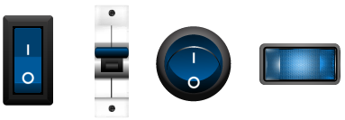
The Illuminated Toggle Switch widget is a control method used to output either of two possible values. When used with a digital I/O tag, the switch will send a 1 for on and a zero for off. When used with a Selector switch, the values will be those configured for the first two of the three possible positions of the selector switch.
To indicate to the operator that the image is a button, a highlight is drawn when the pointer is over the switch.
In the event that the position feedback from the Selector Switch indicates that the actual position is not the same as the requested position, the border of the image will blink using the mismatch color. You should select a color that stands out clearly on your page background, but red is not advised because it is commonly understood to mean that an alarm has been triggered.
The switch works by toggling between positions 0 and 1 whenever the operator clicks on the button. Should the tag be in an invalid state (which will not be unusual when a selector switch is first created) then it is not clear whether the first click should move the switch to the state 0 or the state 1 position. For this reason, a dialog will prompt the operator for an initial position.
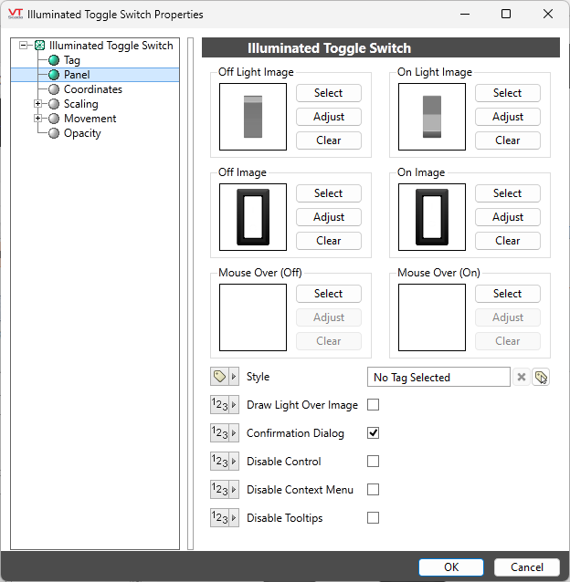
The Properties dialog for an Illuminated Toggle.
Style
Optionally, select Style Settings Tags to control the colors shown by the light, in response to the linked tag's value and alarm state.
Off Light Image / Off Image
The image used for each position is composed of two parts: a basic light and a frame with semi-opaque lens that provides shape to that light.
Within the Bitmaps\Selector Switches\ folder of the Images palette, lights and lens images that are designed to work together will have matching names.
Image Select
Opens the Select Image dialog, within which you can browse for images, import new images, and select the image to use.
VTScada recognizes the following image formats: .BMP, .CUT, .EMF,. JPG, .PCX, .PNG, .TIF, .SVG* .WMF
Using .SVG images comes with the following considerations:
• SVGs are resource heavy! They are slower to draw than other image types and roughly twice as costly as .PNG and .JPEG. They are intended for images that must scale without loss of resolution. Reconsider your file type if the image is larger than 1MB or will be redrawn often.
• Animated SVGs are not supported.
• Only elements supported by Microsoft Direct2D are supported. Unsupported elements won't load.
• .SVG images are only supported on Windows 10 version 1703 and up. In applications running on earlier versions of Windows, .SVG images won't load.
Image Adjust
Opens the Adjust Image dialog box, which can be used to change the color and other display characteristics of the image. See: Adjust Image Dialog
Image Clear
Remove the selected image and do not select a replacement.
On Light Image / On Image
Similar to the Off Light Image and Off Image. Selects the light and lens images to display when the toggle is in position one.
Mouse Over
The Mouse Over image to be used when the toggle is in position one. When left blank, the Illuminated Toggle will be highlighted when the operator moves the pointer over it.
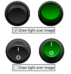
Draw light over image
Reverses the order of the light and the lens. Typically, the lens will contain the On/Off label, therefore choosing this option will hide the label and accentuate the color.
Options
Confirmation Dialog / Disable Control / Disable Context Menu / Disable Tooltips.
Refer to Operator Interaction Controls for a full description of these standard widget options.s
Buttons & Switches\
