
See also: Illuminated Toggle Switch Widget
* Does not use the Style Settings tag.
The Toggle Switch widget, one of the native widgets for Selector Switch tags, is a control method used to output either of two possible values. The values will be those configured for the first two of the three positions of the selector switch, 0 to 1.
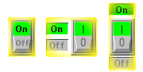
A variety of switch images are available in the Selector Switches images group. A few of the available choices are shown here (for every On image there are matching images for the Off state and the Invalid state, drawn in the same style).
The color and image choices work the same way as an Image Change Widget. In addition to the images from the Selector Switches image group, you can use any image that has a color indicator region defined within it (pump and motor images commonly include these indicator regions). This will allow you to use an equipment image as a toggle button in your application. You could also choose to not use any image, and simply place the rectangular drawing area over a region of active orange (RGB 255, 160, 0) to create a custom control toggle.
To indicate to the operator that the image is a button, a hotbox is drawn around it. A hotbox is commonly understood to define an area that can be clicked upon as a control action.
In the event that the position feedback from the selector switch indicates that the actual position is not the same as the requested position, the border of the image will blink using the mismatch color. You should select a color that stands out clearly on your page background, but red is not advised because it is commonly understood to mean that an alarm has been triggered.
The switch works by toggling between states 0 and 1 whenever the operator clicks on the button. Should the tag be in an invalid state (which will not be unusual when a selector switch is first created) then it is not clear whether the first click should move the switch to the state 0 or the state 1 position. For this reason, a dialog will prompt the operator for an initial position, using the terms you provide in the Selection Dialog area.
Selecting the Confirmation Dialog option will force the operator to confirm each click on the button by selecting OK or Cancel from a dialog.
Use State 0 Image For All States
Select this box if you wish to use the image selected for State 0 for all states of the tag.
You might select this if using an image that has an indicator area (a small rectangle at the base), which is to change color according to the state of the tag.
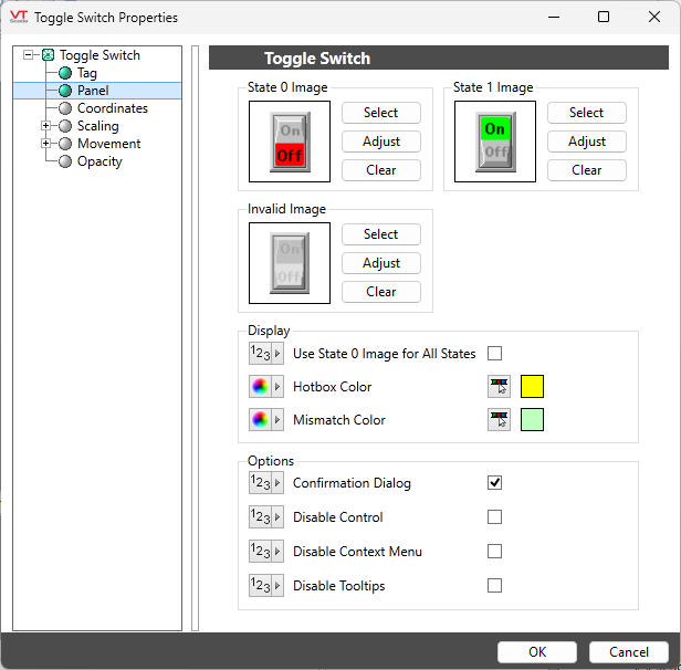
State x Image
Image Select
Opens the Select Image dialog, within which you can browse for images, import new images, and select the image to use.
VTScada recognizes the following image formats: .BMP, .CUT, .EMF,. JPG, .PCX, .PNG, .TIF, .SVG* .WMF
Using .SVG images comes with the following considerations:
• SVGs are resource heavy! They are slower to draw than other image types and roughly twice as costly as .PNG and .JPEG. They are intended for images that must scale without loss of resolution. Reconsider your file type if the image is larger than 1MB or will be redrawn often.
• Animated SVGs are not supported.
• Only elements supported by Microsoft Direct2D are supported. Unsupported elements won't load.
• .SVG images are only supported on Windows 10 version 1703 and up. In applications running on earlier versions of Windows, .SVG images won't load.Image Adjust
Opens the Adjust Image dialog box, which can be used to change the color and other display characteristics of the image. See: Adjust Image Dialog
Image Clear
Remove the selected image and do not select a replacement.
Invalid Image
Provides the same function as State X Image for the case when the tag’s value is Invalid.
Hotbox Color
When the operator moves the mouse pointer over the Toggle Switch image, a hotbox will appear to help indicate that this is a control that can be clicked. Use this option to select the hotbox color.
Mismatch Color
If the associated Selection Switch tag detects that the actual position of the switch is not the same as the position that the operator requested, a box of the mismatch color will blink around the switch image to indicate a problem. The color selected for this should provide a good contrast from the page background, and should also be a color that the operator will associate with a problem condition.
Confirmation Dialog
Select this option if you want the operator to have to confirm each control action from this object. See also: Confirmation Prompts for Output Tags.
Disable Options
Disable selected operator-interaction features of this widget.
See: Operator Interaction Controls
Buttons & Switches\
Choices for Operator InteractionChoices for Operator Interaction
