Display Tab of the Edit Properties Page
Use the Display tab to set the general appearance and behavior of the windows within your application.
Click to expand
General options set the overall appearance of the application. Window behavior options include control over the what operators may do to modify the window size, which page is the default at startup, the default background color for new pages and whether page content should stretch to fit the page. (That last option is better controlled in the Idea Studio).
Default size and minimum allowed size can both be set, measured in pixels, and you have control over the content of both the title bar and the navigation bar. The display tab also provides controls over map features including minimum and maximum zoom levels, the allowed area within which maps are shown, and the ability to do a bulk download of map tiles, to be cached on the local server.
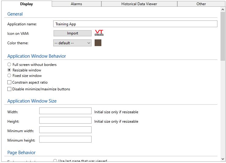
General
| Property | Stored as | Description |
|---|---|---|
| Application Name | Name | Holds the displayed name of the application. Changes to this property do not affect the path to the application folder. |
| Icon on VAM | Select any image to be used to represent the application in the VAM. Images larger than 38x20 pixels will be scaled to fit. In order for the icon to blend smoothly into the VAM, rather than appearing as a rectangle, any pixels in the image file that are not a part of the actual icon should be transparent. |
|
| Color Theme | AppTheme |
Select the overall color theme for the application. |
Application Window Behavior
| Property | Stored as | Description |
|---|---|---|
| Full screen without borders | DispMgrFullScreen | When selected, options for the window size and title bar decorations are disabled. The application will fill whatever screen it is displayed within. You should design the application to fit the smallest screen that it will be displayed on. |
| Resizable border | DispMgrResizable |
Operators may drag the window borders to the size they want to view. Scroll bars will be added if the application size exceeds the window. The property, DispMgrResizable, is treated as 0 (false) when using multiple display windows with DispMgrHoriz, DispMgrVert |
| Fixed size window | (a combination of the above two properties) | Width and height may be set in the following section. Minimum window size options are not relevant. |
| Constrain aspect ratio | DispMgrAspectRatio | This option is available only when the resizable border has been selected. Any change to one dimension of the page is matched by a change to the other. |
| Disable min\max buttons | DispMgrMinMaxDisabled | Only available in combination with resizable border option. |
Application Window Size (Values measured in pixels.)
| Property | Stored as | Description |
|---|---|---|
| Width | DispMgrWidth | Sets the initial width of resizable windows. Sets only the width of constrained windows. |
| Height | DispMgrHeight | Sets the initial height of resizable windows. Sets only the height of constrained windows. |
| Minimum width | DispMgrMinWidth | Only for resizable windows, ensures that the width is no less than this value. Does not apply to constrained or full-screen windows. |
| Minimum height | DispMgrMinHeight | Only for resizable windows, ensures that the height is no less than this value. Does not apply to constrained or full-screen windows. |
Page Behavior
| Property | Stored as | Description |
|---|---|---|
| First page at startup | Page |
Choose which page will be shown upon application startup. You may return to the last page viewed, or use the drop-down list to select any page in the application. If you choose a parameterized page, you should set the values that will be used for those parameters using the Set Page Parameters button. Failing to do so will result in the operator being prompted for parameter values when the application starts. |
| Background color | DefaultPageColor | Sets the default color for all pages that have not been configured with their own background color. |
| Stretch contents | ScaleDisplayContent |
When selected, the page display will be scaled to fill the available area of each window, excepting the editor window. This option is useful in the case that the application is displayed full-screen on many computers, each having a different screen size. Automated display scaling works reasonably well when enlarging the page. It cannot do as good a job when shrinking a display for a smaller screen. In particular, labels embedded within buttons or widgets are more likely to be truncated than scaled down. |
| Maintain aspect ratio | MaintainAspectRatio | If set to 1 (true), then pages will maintain their aspect ratio when stretched. |
Map
| Property | Stored as | Description |
|---|---|---|
| Minimum zoom level | SlippyMapMinZoomLevel | The minimum (furthest out) zoom level allowed. |
| Maximum zoom level | SlippyMapMaxZoomLevel | The maximum (closest in) zoom level allowed. |
| Set area limiting | MapAreaLimiting |
See: Limit the Map Area |
| Bulk download | Not a property |
Title Bar Contents
Configuration may be set independently for the standard display (Normal page) and for pop-up pages. When selected, the default is to use all decorations for the normal page and no decorations for pop-up pages.
The title bar includes ten separate items, each of which may be displayed or suppressed. The title bar itself must be selected for display in order for any of the decorations to have meaning.
Time format & date format:
Use the selectors to choose how time and date should be displayed in the title bar. If the available options do not include the format you prefer, open the Advanced Mode and change the values for DispMgrDateFormat and DispMgrTimeFormat.
Task Bar Contents
As with the title bar, configuration may be controlled independently for a normal page and for pop-up pages. The default is to show all task bar tools on the normal page and none on a pop-up page. As of release 11.2.23, independent control is available for the tiled menu and the list menu.
Page buttons are added by operators, and are unique to each operator. Choosing "Show Page Buttons" does not cause any to appear if the operator has not added them using the pin button, but deselecting the option will cause an operator's page button shortcuts to vanish.
