Checkbox Switch Widget
* Does not use the Style Settings tag.
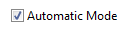
The Checkbox Switch widget is used to create an On/Off control for a two-position SelectorSwitch tag. Each time an operator clicks on the box or attached label, the switch will toggle between positions and a check mark will be displayed for position 1.
This is a control-type widget that is only available for selector switches - it is not available for use as an indicator with Digital Input or Digital Status tags.
When displaying more than one check box on a page, each one must be given a unique value for its Focus ID.
The properties dialog for the check box is as shown:

Display
Title
Provide a descriptive label for the check box. May be left blank.
Box on Left
Select whether the box is to go to the right or the left of the label. The label itself will change justification to match the box (left-justified when the check box is on the left and right-justified when the box is on the right).
Invalid Color
Sets the color that will be displayed when the attached Selector Switch tag is in an Invalid state. May indicate either an error in communication or a Selector Switch with no feedback that has not yet been set to any position.
Mismatch Color
Sets the color that will be displayed when the Selector Switch's position feedback indicates that the equipment is in a state other than the one most recently set using this widget.
Not Checked Text / Checked Text
Text to label position 0 (typically "Off") and position 1 (typically "On").
Options
Confirmation Dialog / Disable Control / Disable Context Menu / Disable Tooltips.
Refer to Operator Interaction Controls for a full description of these standard widget options.
Forms
Include in Form
Select if this widget is to be included in a data entry form. If selected, this widget will interact with the submit, clear and date time selector widgets.
Time Offset
A numeric value that specifies the quantity of time offset. A time offset is added to a date selector offset. A 15 minute offset applied to an 11:00 AM submission will be recorded as 11:15 AM.
Time Units
A droplist that specifies the unit of time offset in minutes, hours, days or weeks.
Buttons & Switches\Basic Controls\
Basic Components\Button Controls\
Tools\Forms\
