
Used by: Data Entry Forms
The submit button is used with other form-related widgets. For data entry widgets with "Include in Form" enabled, values can be filled into their fields but it won't be submitted until this submit button is clicked. The submit button must be on the same page or pop-up as the enabled data-entry widgets.

The properties dialog for the Submit Button widget:
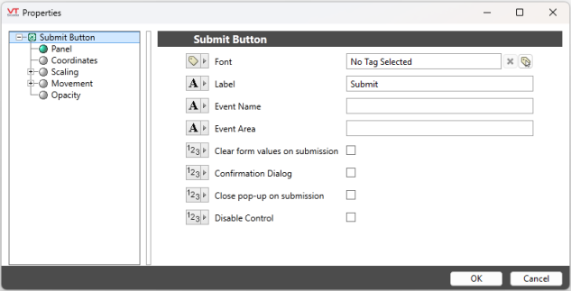
Font
The font used to display the label. Defaults to the current system font.
Label
Text to display on the button. Defaults to "Submit".
Event Name
This value will be used in the Name column of the Alarm Page.
Event Area
This value will be used in the Event Column of the Alarm Page.
Clear form values on submission
Enable to automatically clear values from the form upon submission.
Confirmation Dialog
If selected, the operator must confirm the action before all values are submitted.
Close pop-up on submission
If the form is a pop-up, enabling this option will auto close the pop-up when submit is clicked.
Disable Control
When selected, operators will not be able to use this widget to submit the populated values. It is possible to create an expression that will check the identity or privilege set of the current operator before enabling this option. See the examples at the end of Examples of Expressions.
A submit button widget with Disable Control enabled will appear "grayed-out" if displaying a label.
This option affects only the submit button widget being configured. In the unlikely event that a second submit button is added to this page, disabling the first submit button will not disable the second.
Tools\Forms\
